Wednesday, November 22, 2017

Web Mercator is different than Mercator projection

google maps bing maps esri


The use of mobile apps and online maps is increasing. Everybody has access to and uses online map services such as google maps, street view or ESRI online maps. However, very often when GIS professionals use such maps as base for geo-referencing, they forget that they use a different coordinate system. 

This new reference system is the so-called Web Mercator or Pseudo Mercator or EPSG3857. Many people wonder what's the difference? and why a Feature class using a Mercator projection changes when transformed into Web Mercator?

What is the difference?

A first and simple difference is that they have different false Easting and false Northing data. However, that is not the main difference.

A standard Mercator projection is cylindrical conformal projection. I stress the word conformal because it is a key feature that made this projection so popular and the big difference with the Web Mercator.

A conformal projection, as defined by J Snyder, means that the shape of every small feature of the map is shown correctly, the relative angles at each point are correct, and the local scale in every direction around any one point is constant. Thus, it preserves shapes and angles. On the other hand, Web Mercator is not a conformal projection.

ellipsoid vs sphere projections
Fig 1. Conceptual difference between spherical and ellipsoid projections

Why Web Mercator is not a conformal projection?

Standard Mercator assumes an ellipsoid, while Web Mercator assumes a sphere. Web Mercator assumes a sphere because the equation are simpler and faster to calculate. NOTE: We must consider that online maps are projected online; that means that all the calculations are performed online, which is slower than off-line calculation. This is why sometimes zooming online takes so long.

The ellipsoid-sphere differences generate differences that should be corrected by a scale factor Fig 1.). However, including such correction would be computationally expensive. Web Mercator is used online and requires simple equations. Otherwise, the visualization would be slow. Thus, Web Mercator neglects such corrections.

The differences are function of the latitude (Fig. 2). Latitudes closer to the equator have small errors, and the error increases as the latitude distances from the equator. The shape error in most populated areas (less than 50 degrees latitude) are small and negligible for a general visualization purposes; the computational cost of correcting such differences would be too high for such little differences. However, if detailed measurements are required, the errors would become important.

geodetic errors with latitude
Fig 2. Error of Web Mercator projection


Tuesday, September 12, 2017

Tropical storms: Hurricanes, Typhoon, Clycones


Last week the Caribean islands, America and Gulf of Mexico experienced 3 Hurricanes in a row. At the same time, important Typhoons are developing on the Asia-Pacific region.

Basically, the three terms are the same. They all are tropical storms caused by the same reasons. Moist over the warm tropical ocean rises causes a low pressure area. Surrounding air pushes into this lower pressure area; thus, this air warms and rises. As this warm air rises, it cools forming cliuds and rain. Because of the Coriolis force this whole system of air, cloud, rain and wind beging spinning and growing.

Fig1. Formation of a tropical storm

The only difference between Hurricanes, typhoons and Cyclones is the local name they receive in different regions. 

Fig 2. Tropical storms different names

Hurricane
Tropical storms in the American region (Atlantic Ocean and America-Pacific) are known as Hurricanes. The word originates from the Mayan storm god Hunraken. Mayan people and other people from the region used the word to describes the stroms that were though to be a punishment from the god Hunraken

Typhoon
Tropical storms in the Asia-Pacific region are called Typhoons. In 1560 the Portuguese sailor Pinto made the first description of this tropical storm by using the word tufao. Tufao derives from the Chinese words tung (east) fung (wind). Chinese used these words to describe the strong windy storms coming from the East.

Cyclone
Cyclones are tropical storms on the Indian ocean. The first reference to this word is from the British sailor Piddington. The word originates from the Greek words kyklon (moving in a circle).
Strongest Tropical storms

Classification
Tropical are classified into 5 categories based on their wind speeds.
Category Wind speed [mph]
1 74-95
2 96-110
3 111-129
4 130-156
5 >156

Strongest tropical storms

Storm Year Winds [km/h] Wind [mph] Location
Patricia 2015 345 214 South of Mexico
Allen 1980 305 189 Caribean, North of Mexico
Irma 2017 295 183 Caribean, Florida
Wilma 2005 295 183 Gulf of mexico
Linda 1997 295 183 South of Mexico

Wednesday, August 9, 2017

Intercontinental Ballistic Missiles

  
During the last months we heard (and read) a lot of news about ballistic missiles and potential threads of North Korea testing Intercontinental Ballistic Missiles (ICBM). But what is an intercontinental ballistic missile and why does it pose such a threat?
          
First, it is important to understand what a ballistic missile is. Basically, there are 2 types of missiles: ballistic missile and cruise missiles (will be explained in another post).
A ballistic missile is a missile that follows a ballistic trajectory; that is, the path that any given thrown object (or projectile) without propulsion would take under the action of gravity. A theoretical perfect projectile trajectory only considers gravity but real projectiles also consider additional forces such as friction due to aerodynamic drag (Figure 1).
Fig 1. Ballistic trajectory

The flight of a ballistic missile has 3 phases: A first phase is a powered flight (launching); in long range missile the launching requires enough force so that the missile escapes the atmosphere. The second phase which is the longest phase is the free flight (a ballistic projectile). Usually, this second phase is outside of the atmosphere; hence, the missile has less friction. The third phase is the re-entry phase.
Range
Ballistic missiles can be divided in four groups based on their range (Figure 2):
Short range ballistic missile. This missiles have a range between 300 km to 1000 km and may reach their target in less than 10 min.
Medium range. This missiles have a range between 1000 km and 3500 km and may reach their target in between 10 min to 15 min.
Intermediate range. This missiles have a range between 3500 km and 5000 km and may reach their target in between 15 min to 20 min.
Intercontinental range. This missiles have a range greater than 5000 km (up to 13000 km) and may reach their target in between 20 min to 30 min.
Fig 2. Range of ballistic missiles if launched from North Korea

The thread
ICBM are big threat to world's peace because of 2 factors: their range and short time to reach their target.
Range. Ballistic missiles flying above the atmosphere have a range much longer than any other missile. ICBM may easily reach target distances about 10000 km.  That is, a missile launched from North Korea may reach any European capital, any Asian city, Australia or even some major American cities such as Seattle, Los Angeles, Las Vegas or Houston.
Time to target. ICBM may reach velocities about 5 km/s and may require only 30 min to travel up to 10000 km. That is, any of the previously mentioned cities could be destroyed in just 30 min after the launch is detected. With such a short time, there would be no option to evacuate or to appropriate shelter. Thus, ICBM are lethal.

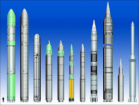
Fig 3. Ballistic missiles

This short introduction to ICBM clearly illustrates their potential as destructive lethal mass destruction weapons. Although America is developing-testing a missile defensive system, ICBM are still a threat 

Sunday, July 23, 2017

Online hydraulic design and calculations


The advance in mobile apps and internet accessibility changed the way we socialize and the way we work: Sharing information, instant communications, cloud computing and online calculations are just few examples of the internet in our daily life. One advantage of mobile apps and online calculations is that they liberate us from the desktop and allows us performing engineering calculations on site, as soon as we need or as soon as we collect new data.

Fig1. Welcome screen OTOSHEE

Some years ago, I created a website for performing some calculation that I used quite often. Over the years I’ve been including new equations, but the interface was not so friendly. I decided to improve the interface and make it friendlier, so that it can be used by others. Try the online hydraulic design website.

Fig 2. Screen OTOSHEE

Available options

The web site http://otoshee.eu.pn/ contains sections for:
  • Time of concentration. 4 time of concentration equation are available.
  • Rip rap. Rip rap sizing for piers and abutments.
  • Weirs & gutters. Discharge estimation for weirs and gutters.
  • Pipes. Head losses and minimum pipe diameter estimation.
  • Scour. Hydraulic scour estimation for groynes, weirs and pipes.
  • IDF precipitation. An online interactive GIS map with IDF equation for different locations.

Fig 3. IDF precipitation screen

Tuesday, July 11, 2017

Precipitation intensity for highway & bridge drainage design

Bridge with mist

Drainage projects usually consider a precipitation intensity based on the time of concentration and the return period. However, when designing drainage systems for bridges and highways it is important to verify the compatibility between the precipitation intensity and the driver's safety. Thus, two additional criterion should be considered: Hydroplaning and visibility.

Sunday, March 19, 2017

Bridge collapse (Peru) & stream bank erosion

Last days a video of a bridge collapse in Lima (Peru) became viral. The video shows the moment when the scour of a bridge gets scoured and the bridge collapses. Discussions about the collapse of this bridge became a trending topic in several social networks, especially in Peru.

Some discussions tried to find someone or something to blame and others focussed on whether the bridge was properly designed or not. In this post we will not discuss such topics. Whether there is someone to blame or not; whether it was properly designed or not, the fact is that the video a good example of stream bed erosion.

Due to space limitation, this post will be an introduction to stream bank erosion. In a future post we may simulate in detail the erosion process of the video and analyse whether a properly designed rip rap would have prevented the erosion (and collapse) or not.
Fig 1. Bridge collapse due to stream bank erosion in Peru (Source youtube)

Rivers are dynamic systems that change over time. One of the processes defining such change is stream bank erosion. All rivers have stream bank erosion. Even the so-called stable rivers have eroding banks. Certain events such a flooding usually trigger stream bank erosion

Stream bank erosion becomes even more complicated when the steam has bends inducing secondary flows. Even small bends create a vertical velocities profile and a helicoidally flow known as centre region cell. Besides this helicoidally flow, the outer bank of the river also experiences a so called outer bank cell flow. This outer bank cell flow is a small helicoidally flow with a direction that opposes the main helicoidally flow. Although the outer bank cell is small and weak, it plays an important role in stream bank erosion.
Fig 2. Secondary flows (Source: Blanckaert and Vriend 2004)

The full solution of the stream bank erosion is quite complicated. Thus, simplified approaches were developed based on the main mechanisms controlling stream bank erosion. The mechanisms controlling stream bank erosion may be divided in two groups: Scour and Mass failure
  • Mass failure is the process when large chunks of bank material collapse into the river. Sometimes mass failure is a consequence of local scour removal.
  • Scour failure is the direct removal of bank material

There are two main modelling approaches for analysing bank erosion due to the mentioned processes:
  • Bank failure. Bank failure is a geotechnical based model that evaluates the bank stability and its critical failure plane. Once the soil gets saturated due to the flood, several theoretical failure planes are analysed considering its resisting forces and the driving forces, in order to define the one with the lowest safety factor. If the critical safety factor is lower than one, then all the soil above the plane will be eroded by mass failure.
Fig 3. Mass failure (Source: Carey B 2014)
  • Toe scour. Toe scour considers the bank material removed by the flow. The shear stress between the flow and the bank toe is evaluated considering the critical share stress and the erodibility of the bank. If the shear stress is higher than the critical shear stress, a portion of the bank will be eroded. After the toe gets eroded, a second failure mechanism may occur. Due to the toe erosion, the soil will look like a cantilever. Depending on the size of toe scour and the volume of soil above the scour whole, a cantilever shear failure may occur.
Fig 4. Toe scour (Source: Carey B 2014)

If we get more information about the physical characteristics of the bridge and the river, in a further post we may simulate the scour process that collapsed this bridge, and analyze in more detail this case.

Monday, March 6, 2017

Automating HEC-RAS tool

Some years ago, (early 2010) I found a way to break the RAS code and to automate some features of HEC-RAS. Thus, I was able to perform sequential modelling HEC-HMSàHEC-RASàSobek1D2D and to perform uncertainty analysis within cloud (Moya Quiroga et al., 2013). At that time there was no literature about the RAS code, so I had to try several options in the Controller class and find out how they work. In October 2015, “breaking the RAS code” was published (Goodwell, C. 2015) and I hurried into getting my copy (I was among the first ones, so it included a 4 colour pen).


HEC-HMS, HEC-RAS, Sobek2D
Fig 1. HEC-RAS in sequential modelling (Source: Moya Quiroga et al., 2013)

Documentation in the book gave me important tips and I was able to develop several scripts for automating many pre-processing and post-processing tasks; not only updating parameters but also modifying geometry and post-processing results. 

HEC-RAS used to be a great tool, but now it became wonderful. However, all my scripts work under the console (no graphical user interface GUI). I developed them and I know how to use them. Thus, I decided to include a user interface in order to make more universal tools. Few years ago I released the first version with a graphic user interface GUI (AHYDRA), a tool for automating hydraulic analysis. Debugging and coding takes time, so I released and didn’t improve it. Few months ago I decided to update it and to release new improved version was released. This version includes new features and some bugs were fixed.

New automatization options for HEC-RAS

The first application that I got for this tool was to improve the boundary conditions in HEC-RAS. This  new version automatically updates data and simulates HEC-RAS considering:
·   Downstream boundary conditions (energy slope). Important for analysing the extent of the uncertainties due to BC and to select the best BC for our case.
·   Manning roughness. Important to analyse the range of potential manning roughness. Besides, it allows analysing a spatial variable Manning. For instance, the Manning range is between 0.03-0.04; we can simulate one cross section with 0.03, the next cross section with 0.034 and so on. Thus, we will be able to perform an uncertainty analysis of manning.
·     Upstream discharge boundary condition. Inflow is usually assumed as a fixed value. However, most inflow discharge data are based on steady state stage-discharge curves prone to errors. Thus, we can perform a sensitivity or uncertainty analysis of the inflow.

Breaking the HEC-RAS code
Fig 2. User interface of AHYDRA

Single and multiple simulations (Monte Carlo).

  •  The single simulations option (at the left of the GUI) allows to automate one simulation by changing one value of the mentioned possibilities.
  • Besides, this version includes the possibility to perform a Mont Carlo analysis by running several simulations and randomly updating the desired parameter within a user specified range. This option is located on the right side of the GUI.
river uncertainty

Rip rap design


The single simulation option also calculates the rip rap size (d50 in SI units) for each cross section, by considering the simulated hydraulic conditions and the USGS rip rap design criterion.

Installaing AHYDRA to automate HEC-RAS

This version includes an installer *.exe. Just double click it and follow the install wizard. After installation AHYDRA will be accessible via desktop and start up menu.

download for HEC-RAS
Scan the QR code with your tablet/smartphone to fill the free AHYDRA request form.


Tuesday, February 28, 2017

Bridge monitoring with satellite data SAR

Civil infrastructure is vital for supporting our life style and economy. However, the prolongued expossure to outdoor weather conditions and time deteriorates the infrastructure. Besides, after some years of decades, the infrastructure do not comply with new construction codes.

This problem of infrastructure deterioration is becoming more important because of the increasing number of infrastructure collapses. Thus, it is important to perform a constant monitoring civil infrastructure.Remote sensing synthetic aperture radar (SAR) data provides a new and modern methodology for monitoring civil infrastructure.
Satellite images applied to engineering
How to monitor infrastructure with satellite data SAR?
The reader may be wondering "How satellite data can used to monitor civil infrastructure such as bridges?". The answer is Interferometric SAR (InSAR) and Differential InSAR.
InSAR takes advantage of the interferometric phase of simultaneous observations. Differential InSAR (SInSAR)  considers the interferometric phase of observations acquired at different times. Soussa and Bastos (2013) explain the concept of DInSAR with Figure 1. Two SAR observations at times T1 and T2 will show the deformation DR.
Active image SAR processing
Figure 1. DInSAR concept (Source: Soussa abd Bastos 2013)

Several studies are beginning to take advantage of DInSAR for monitoring bridges. Soussa and Bastos (2013) analyzed ERS SAR observation of the Hintze Ribeiro centennial bridge in Portugal. The bridge collapsed in 2001 when one of its piles collapsed. 

The study showed that between 1995 and the collapse date the collapsed pile had vertical displacements up to -20 mm yr-1, where the negative sign means that it was sinking. Other example. In 2012, Cusson et al., (2012) made a similar study at larger scale in Vancouver and Montreal, Canada. 

More important than the number of examples however, is the fact that SAR data proved to be an important data source for monitoring civil infrastructure and finding hidden information in collapsed infrastructure.
Satellite images to monitor bridges
Figure 2. Collapsed Hintze Ribeiro centennial bridge (Cource: StockClip)
Satellite monitoring or in situ monitoring?
Civil infrastructure can also be monitored by in situ inspections. Thus, we may wonder what are the advantages of SAR monitoring?; Is it better to use SAR monitoring or in situ inspection?

There is no definite answer to the last question; it depends on the specific case. Nevertheless, Cusson et al., (2012) points some of the main advantages of SAR monitoring. Among the advantages of SAR monitoring we can mention:
  • Increased and constant monitoring frequency regardless weather or time
  • Possibility to monitor the whole structure
  • Monitoring regardless accessibility issues.
In further posts we will provide more details and more application cases of SAR data.In you want to know more about DInSAR and SAR application, feel free to contact us.

Saturday, February 18, 2017

Oroville dam disaster observed by satellite images

Last days we had several news about the Oroville dam. In this post I will not describe the details of this natural disaster because there are already several sites about that that. Instead, I prefer to provide a visualization of this disaster so that we can understand its magnitude and visualize it. For such purpose I used remote sensing satellite data collected before the disaster and during the disaster. In all the images you can get a full screen image by clicking the image.

Satellite images of Orville dam disaster

The figure shows 2 images observed by the French satellite Spot. The left images was observed on November 11, 2016 (before the disaster), while the right image was observed on February 14, 2017 (during the disaster). The water changes are evident. Before the event we easily visualize the shoreline. Besides, we can also visualize 2 details during the event (right image). A) At the dam we can see a white spot which the water over the spillway, and B) the water in the reach between the dam and Oroville city has different colours because of the mud and earth; you can get a full screen image by clicking the image
Flood before and after dam fail
Fig 1. Spot image of Oroville dam before the event (left) and during the event (right) Click the image for full screen image

Thanks to Digital Globe, ESA and Gizmodo, we can visualize in more detail what really happened in the auxiliary spillway. The left image shows the spillway before the event, while the right image shows the spillway during the event. We can observe the spillway at full capacity and the auxiliary spillway already collapsed.

Oriville dam spillway
Fig 2. Image of Oroville spillway before the event (left) and during the event (right) (Source: Digital Globe, Gizmodo). Click the image for full screen image

 The following image shows in more detail the collapse of the auxiliary spillway and the road.
Dam failure
Fig 3. Image of Oroville spillway before the event (left) and during the event (right) (Source: Digital Globe, Gizmodo). Click the image for full screen image

A spanish version of this post was published at iAgua

Sunday, January 15, 2017

10 countries that deforest the most

A forest is an ecosystem; a community of plants and animals interacting with one another and with the physical environment. We depend on forests for our survival, from the air we breathe to the wood we use.

Incendios y deforestacion en Santa Cruz de la Sierra Bolivia
Slider comparing deforestation and land use change in Santa Cruz - Bolivia (Source:http://flood-risk-bolivia.eu5.net/research.html)

Forests provide habitats for animals and livelihoods for humans. Forests also offer watershed protection, prevent soil erosion and mitigate climate change. However, every year thousands of forest hectares are lost due to agriculture, lumber and fires.

Which country deforest the most?
A few days ago an infographic listing the countries that deforest the most was published. However, the infographic focuses on raw numbers and does not consider that fact that the Brazilian forest is bigger than any of the other mentioned countries. Here we rearrange the list considering the forest area of each country.
10 countries that deforest the most

You can visualize the interactive geo-chart of the results (Click here).

10. Congo DR
In 1990 Congo DR had 1 603 630 km2 of forest. By 2015 its forest area was reduced to 1 525 780 km2. It lost 4.8 % of its forest.

9. Colombia
In 1990 Colombia had 644 170 km2 of forest. By 2015 its forest area was reduced to 585 017 km2. It lost 9.2 % of its forest.

8. Brazil
In 1990 Brazil had 5 467 050 km2 of forest. By 2015 its forest area was reduced to 4 935 380 km2. It lost 9.7 % of its forest.

7. Bolivia
In 1990 Bolivia had 627 950 km2 of forest. By 2015 its forest area was reduced to 547 640 km2. It lost 12.7 % of its forest.

6. Tanzania
In 1990 Tanzania had 559 200 km2 of forest. By 2015 its forest area was reduced to 460 600 km2. It lost 17.6 % of its forest.

5. Argentina
In 1990 Argentina had 347 930 km2 of forest. By 2015 its forest area was reduced to 271 120 km2. It lost 22.1 % of its forest.

4. Indonesia
In 1990 Indonesia had 1 185 450 km2 of forest. By 2015 its forest area was reduced to 910 100 km2. It lost 23.2 % of its forest.

3. Birmania
In 1990 Birmania had 392 180 km2 of forest. By 2015 its forest area was reduced to 290 410 km2. It lost 25.9 % of its forest.

2. Zimbawe
In 1990 Zimbawe had 221 640 km2 of forest. By 2015 its forest area was reduced to 140 620 km2. It lost 36.5 % of its forest.

1. Nigeria
In 1990 Nigeria had 172 340 km2 of forest. That is 12.5 % of its territory. By 2015 he forest area was reduced to 69 930 km2. It lost 59.4 % of its forest.
environmental destruction by countries